In this tutorial we will walk you through the basics of shiny.semantic.
Quick Q&A
First of all, let’s answer a few questions:
- Why do I need
shiny.semantic?
You can build your Shiny apps with standard shiny UI that relies on Bootstrap.
This means that Shiny attaches CSS and JS code that is responsible for its neat look.
However, after a while you might notice that all apps made this way tend to look quite similar.
shiny.semantic helps you to add a fresh look to your web application by providing an alternative
UI framework that works under the hood.
- What
shiny.semantichas to do with Fomantic UI?
Similarly to Shiny attaching Bootstrap CSS and JS libraries, shiny.semantic relies on
Fomantic UI. Historically, we built this package around Semantic UI
library, but it got deprecated and now (since December 2019) we rely on the well-supported
and maintained community fork called Fomantic UI.
- Do I need to learn a new syntax to be able to use it?
Not at all! For your convenience, we created wrappers of the most popular functions
that you know from Shiny. For example, you can create an action button using a
snake case (which is a shiny.semantic standard): action_button, or
you can use, more familiar from Shiny, camel case with consistent parameters: actionButton.
Note, however, that the philosophy behind the Bootstrap and Fomantic is quite
different, so some behaviour might also differ. Usually shiny.semantic warns you or you
can learn more about it from documentation of a specific function.
- Can I use standard Shiny components with
shiny.semantic?
It depends. In general, to be able to render shiny.semantic components correctly,
your app UI code must be surrounded by semanticPage (equivalent of fluidPage)
function that switches off standard Bootstrap dependencies. Thus some components from
Shiny might look just bad, but don’t worry - most of them have shiny.semantic alternatives.
Having said that, all of standard HTML elements from Shiny should work just fine
(like shiny::div or shiny::h2).
How to use shiny.semantic?
You can use shiny.semantic in two ways:
(a) Using Fomantic CSS classes
If you know this and that about web development, you can create a number of components
by extending standard Shiny objects with class definitions from Fomantic UI
documentation. For example:
div(class = "ui raised segment",
  div(
    a(class="ui green ribbon label", "Link"),
    p("Lorem ipsum, lorem ipsum, lorem ipsum"),
    actionButton("button", "Click")
  )
)
plot of chunk unnamed-chunk-2
(b) Using predefined objects
If you are not that comfortable with web development, you can take advantage of the number of elements that we implemented for you. See some examples below:
range_input("range", 10, 15, 0, 20)
text_input("txt", type = "text", placeholder = "Enter Text")
date_input("date")
For more components visit our Components live demo website
or the examples/ folder on our repository.
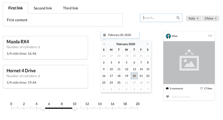
Little sneak-peak of what you can get is listed on the graphics below. Most of the components you may insert with just single line of code!
If you want to learn how to use a particular UI component, check its documentation. For example, you can call in RStudio (to see the docs for a counter button):
?counter_button
or use our documentation website.
All examples come with easy to use code snippets that will help you get started.
We hope that this short overview was useful. Good luck with building your first amazing
app with shiny.semantic :)