![]()
![]()
signs makes it easy to use typographically accurate
minus signs in plots, markdown, dashboards, or other presentations.
Ask any typography nut, and they can walk you through the differences among 4 symbols that look nearly identical:
The true minus, when a typeface has one, is designed for mathematics. It has the same length and line thickness as the crossbar of the plus sign, and it sits at the same height above the baseline. By comparison, the hyphen-minus is quite a bit shorter and sits lower. Hyphens were designed, not for mathematics, but primarily for joining words.
Oddly there is no shortcut for true minuses on Windows. There are a few options on Mac, and of course major Linux distros like Ubuntu support entering Unicode. Fixed-width coding fonts that are intended for coding, such as FiraCode, use ligatures to mimic the minus glyph. But the Unicode minus will work with whatever presentation font you prefer, and it has the advantage of being understood properly by most screen readers.
For me, using a Unicode minus is like brewing high-end tea or wearing my favorite socks. Maybe nobody else notices, but it still looks good to me. If you like me enjoy the little things, this package may grow on you!
You can install signs from CRAN,
install.packages("signs")or grab the dev version from GitHub:
# install.packages("devtools")
devtools::install_github("BenjaminWolfe/signs")Using signs is simple, especially if you’re familiar
with functions like scales::number(),
scales::number_format(), scales::comma(),
scales::comma_format(), scales::percent(), and
scales::percent_format(). It simply provides two new
functions to complement these: signs::signs() and
signs::signs_format().
See vignette("signs") for a full tour of the
package.
The difference between minuses is impossible to see with most coding typefaces. That’s not a problem with the package; it’s just how fixed-width fonts work. (How ugly would your code look if characters had different widths?)
library(scales)
library(signs)

x <- seq(-4, 4)

# hyphen-minuses
number(x, accuracy = 1)
#> [1] "-4" "-3" "-2" "-1" "0"  "1"  "2"  "3"  "4"

# true minuses
signs(x, accuracy = 1)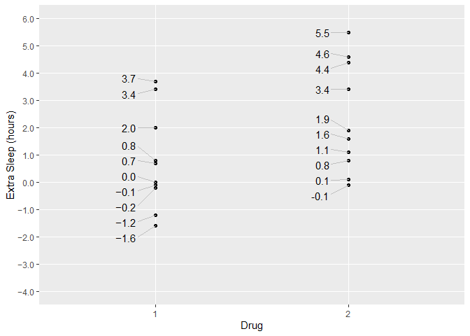
#> [1] "−4" "−3" "−2" "−1" "0" "1" "2" "3" "4"We can see the difference in a plot.
signs(). So is the y-axis:
signs_format().scales::number().library(dplyr)
library(ggplot2)
library(ggrepel)
theme_set(theme_gray())
theme_update(panel.grid.minor = element_blank())
p <-
ggplot(sleep) +
aes(group, extra) +
geom_point() +
xlab("Drug") +
ylab("Extra Sleep (hours)")
label_hours <- function(mapping) {
geom_text_repel(
mapping,
nudge_x = -.1,
direction = "y",
segment.size = .4,
segment.color = "grey75",
hjust = "right"
)
}
p +
label_hours(
mapping = aes(
label = case_when(
group == 1 ~ signs(extra, accuracy = .1), # Unicode minuses
group == 2 ~ number(extra, accuracy = .1) # ASCII minuses
)
)
) +
scale_y_continuous(
limits = c(-4, 6),
breaks = seq(-4, 6),
labels = signs_format(accuracy = .1) # Unicode, analogous to number_format()
)