
![]()
![]()

A library for creating time-based charts, like Gantt or timelines.
Possible outputs include ggplots, plotly
graphs, Highcharts or data.frames. Results can be used in
the RStudio viewer pane, in R Markdown documents or in Shiny apps. In
the interactive outputs created by vistime() and
hc_vistime() you can interact with the plot using mouse
hover or zoom. Timelines and their components can afterwards be
manipulated using ggplot::theme(),
plotly_build() or hc_*functions (for
gg_vistime(), vistime() or
hc_vistime(), respectively). When choosing the
data.frame output, you can use your own plotting package
for visualizing the graph.
I’m glad if this can help people save time and effort, like this feedback suggests:
If you find vistime useful, please consider supporting its
development:

Feedback welcome: sa.ra.online@posteo.de
To install the package from CRAN, type the following in your R console:
install.packages("vistime")To install the development version containing most recent fixes and improvements, but not released on CRAN yet, see NEWS.md), run the following code in an R console:
if (!require("remotes")) install.packages("remotes")
remotes::install_github("shosaco/vistime")This package vistime provides four main functions, the
first three allow you to draw a timeline with Plotly, Highcharts or
ggplot2, the last one outputs the pure optimized data frame ready for
plotting.
Plotly chartstimeline_data <- data.frame(event = c("Event 1", "Event 2"),
start = c("2020-06-06", "2020-10-01"),
end = c("2020-10-01", "2020-12-31"),
group = "My Events")
vistime(timeline_data)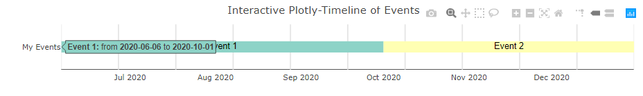
Highcharts timelinestimeline_data <- data.frame(event = c("Event 1", "Event 2"),
start = c("2020-06-06", "2020-10-01"),
end = c("2020-10-01", "2020-12-31"),
group = "My Events")
hc_vistime(timeline_data)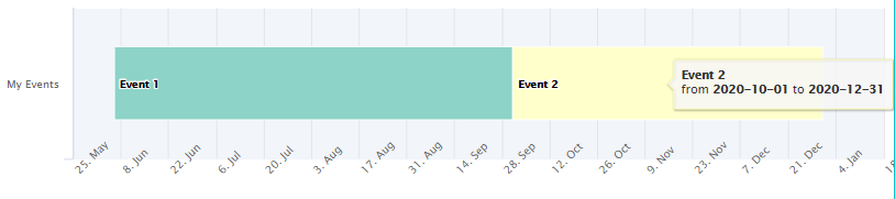
This is facilitated by the highcharter package, so, this
package needs to be installed before attempting to produce any
hc_vistime() output.
ggplot2 outputtimeline_data <- data.frame(event = c("Event 1", "Event 2"),
start = c("2020-06-06", "2020-10-01"),
end = c("2020-10-01", "2020-12-31"),
group = "My Events")
gg_vistime(timeline_data)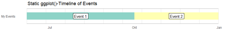
data.frame output if you want to draw yourselftimeline_data <- data.frame(event = c("Event 1", "Event 2"),
start = c("2020-06-06", "2020-10-01"),
end = c("2020-10-01", "2020-12-31"),
group = "My Events")
vistime_data(timeline_data)
#> event start end group tooltip col subplot y
#> 1 Event 1 2020-06-06 2020-10-01 My Events from <b>2020-06-06</b> to <b>2020-10-01</b> #8DD3C7 1 1
#> 2 Event 2 2020-10-01 2020-12-31 My Events from <b>2020-10-01</b> to <b>2020-12-31</b> #FFFFB3 1 1You want to use this for the intelligent y-axis assignment depending
on overlapping of events (this can be disabled with
optimize_y = FALSE).
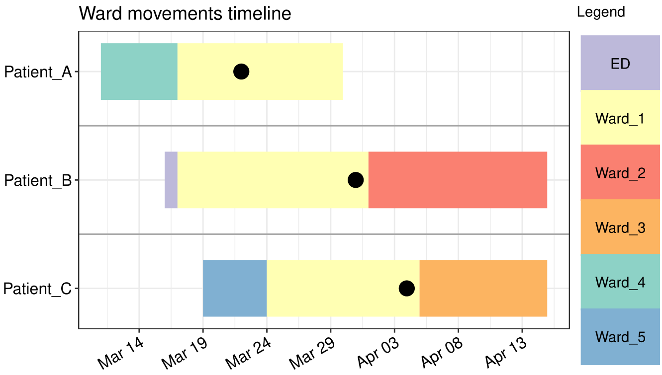
During COVID-19 2020, @wlhamilton used
gg_vistime() for visualizing patient ward movements as
timelines in order to investigate possible hospital acquired infections.
See his
github for the code.
There is a vignette for each of the three functions of the package where they are explained in detail:
vistime() for interactive Plotly
output: Link
to manualgg_vistime() for static ggplot2
output: Link
to manualhc_vistime() for interactive
Highcharts output: Link
to manual